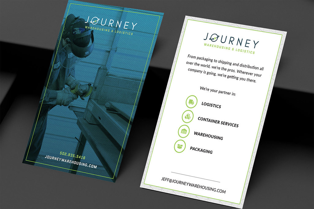
Starting the Journey Off Right
Journey originally started as a pallet repair company and moved into the bulk container industry, where they stayed for years. After expanding their services to include warehousing, logistics and packaging, they needed a new identity and new clients who knew what they offered. That’s where OOHology stepped in. We completed a brand naming exercise, custom logo and a brand new website to reflect their new services.
Before Journey came to OOHology, they had an unsearchable company name, no brand identity, and an outdated site that didn’t reflect what the company offered. We quickly realized the team at Journey was fun, easygoing and willing to try things outside the box, so we got to work bringing their personality to life through the brand.
A Logo of the Future
We recommended a new company name, which ultimately led us to create a completely custom logo. We knew we wanted the logo to feel dependable, strong, global, and state-of-the-art. Journey wasn’t a Mom-and-Pop blue-collar business, but a high-tech logistical service that industry giants could trust, and we wanted to reflect that.
Since Journey offers such a wide variety of services, we knew the logo had to be open enough to encompass everything. We took a futuristic angle through a thin san-serif type that would help them be visually different in a market saturated with chunky, block letters. The O in Journey visually recalls the earth and a small package rotating around it, representing their 4 main services. An unsaturated, matte navy and invigorating bright green brings energy to the logo and pays homage to their sustainable efforts and gives them a fresh appeal that stands out from the target-red and bank-blue that many companies in this segment opt for.


