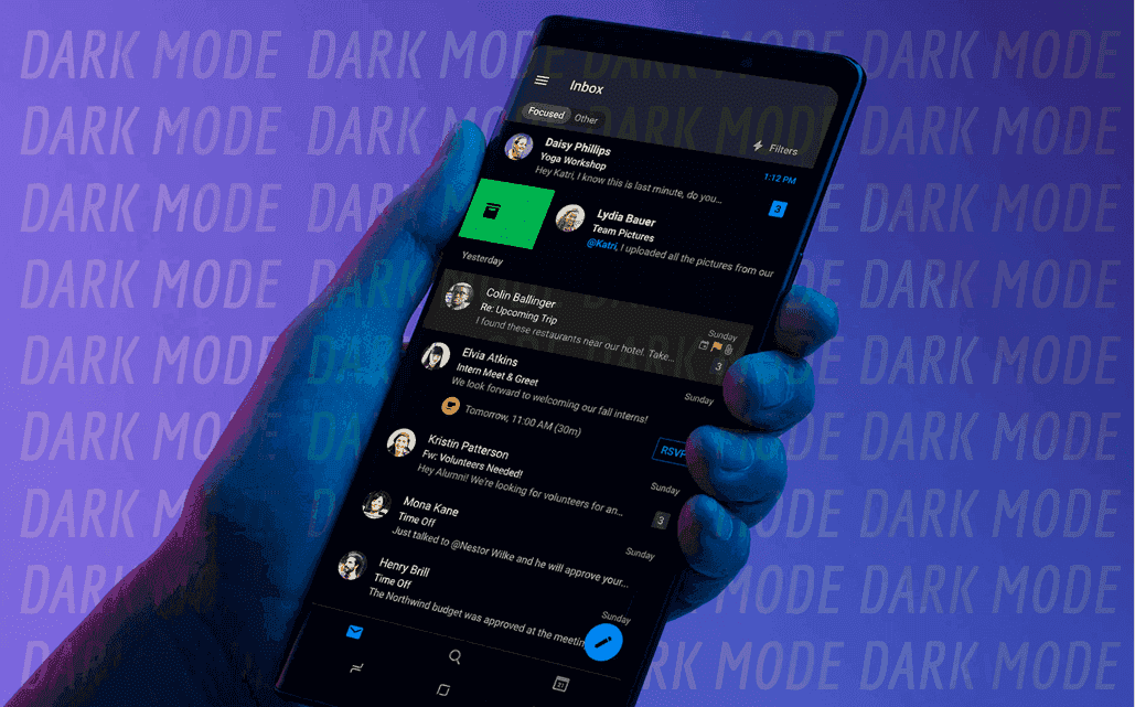
Dark Mode is a setting that all the cool kids are using these days. On most smartphones, as well as other devices and computers, it helps prevent eye strain. And while it is pleasant on the eyes it can be a designer’s demise.
With the popularity of this new setting comes challenges for email marketers and UI designers alike. They’ll have to figure out how shifting colors from light to dark will impact their designs. What needs a background, and what doesn’t. Should the entire email be an image? If it’s an image how will it look on mobile? If they don’t get it right, their messages will look badly designed, which is irritating to the viewer and even more so to the advertiser that’s forking over money to try and reach those viewers.
Let’s start by defining Dark Mode and why people are using it, to help better understand the challenges it brings. Then we’ll talk about some potential solutions to this design conundrum.
DARK MODE
Dark Mode is also known as color inversion. But is it really?
Dark Mode switches the background and font colors in an email from dark text on a light background to light text on a dark background. Dark Mode targets those HTML attributes and CSS properties via internal or inline styles. Then it switches them to make them lighter or darker. It does this by analyzing any color or background color with a CSS property of background, color, background-color, or an HTML attribute of bgcolor or color.
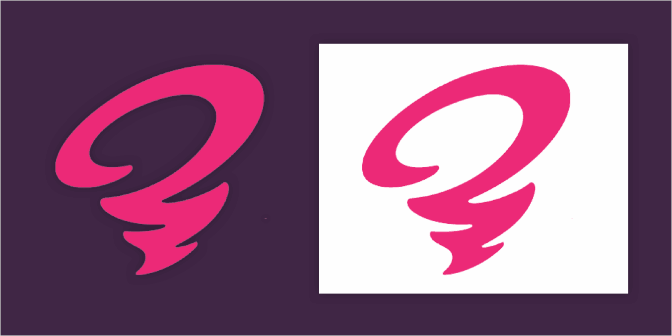
In other words, Dark Mode analyzes any code that says that the type is a darker color and the background is a lighter color and flips the script giving the viewer a more pleasant reading experience. See the example below of the original email next to the inverted version.


WHY IS IT SO POPULAR?
The idea behind Dark Mode is that it helps reduce the amount of blue light emitting from a device’s screen. Blue light is what causes significant eyestrain among heavy device users.
Recent reports show that up to 80% of American adults say that they use their digital devices more than two hours per day. An additional 67% say that they’re on more than two devices at the same time. Hopefully not while they’re driving.
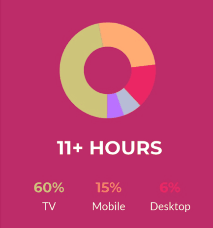
Another report says that people are on their devices for nearly 11 hours a day. That’s a lot of blue light. It’s not just painful on the eyes, though. Continuous exposure to blue light also suppresses the production of melatonin, which we need for sleep. Auto manufacturers use this same blue light to illuminate dashboards to keep drivers from snoozing at the wheel. So that last-minute social media fix before hitting the sack could be keeping you up. Or maybe it’s your “friend’s” extreme political posts.
WHAT TO DO
There are a lot of email marketers trying to figure out solutions to this design dilemma.
Ultimately there are two trains of thought that need to be considered.
- Just accept the parameters and design around them
- Utilize code that overrides the color inversion and thus refusing the user’s desired conversion of the content
TIPS AND TRICKS TO FIGHT THE DARK MODE BLUES
- If at all possible, test your email. There are a few options out there but not many at this point. We’re betting that will change in the near future. In the meantime just send a preview email and switch your device to dark mode to see what others will see.
- Use transparent images with a medium or neutral color.
- Add a white border around dark logos or images that are transparent.
- Hire OOHology to do your email marketing, among other things! (shameless plug here.)

We, as email marketers ourselves, will continue to come up with better solutions as technology evolves and the digital landscape provides more challenges. Until then keep it simple and go with the flow.


