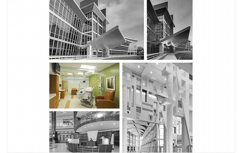
They didn't want just any old agency.
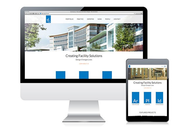
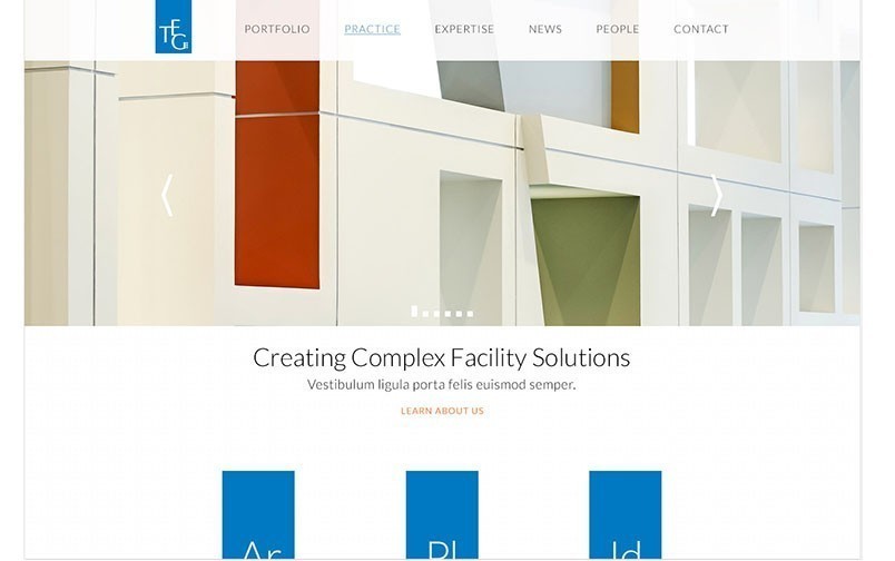
Architecture, Planning and Design firm TEG needed a site that looked and felt like them. Modern, sleek and adaptable. They also needed a complex solution for their expansive portfolio. The only solution was a fully responsive, minimalist website. So that’s what we did.
TEG's Problem
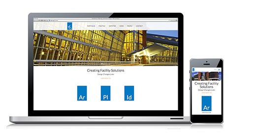
TEG’s website was flash (woof), and they needed something mobile friendly that sales reps could use in the field on tablets, phones or laptops. They knew they needed an agency to help with their website, but not just any ol’ agency – they needed one with web chops. TEG was on the hunt for a beautifully branded and responsive website that was as distinguished as they are.
“It’s exactly what we wanted. The site validates our firm & adds credibility.”
- Janet Lively Herberle, TEG Architects
OOHology's Solution
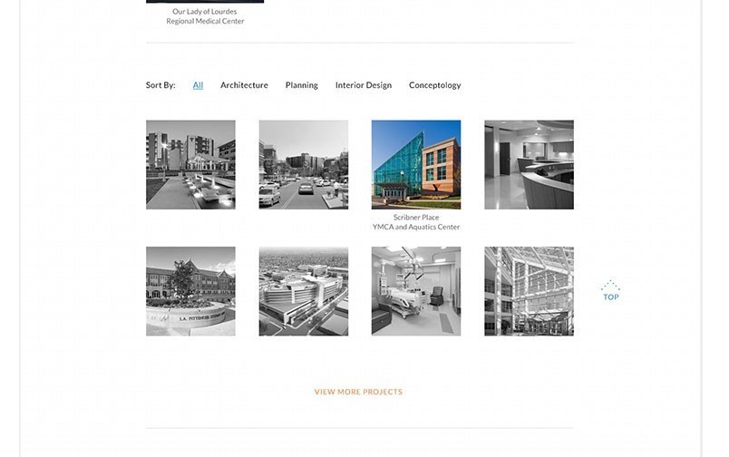
Obviously we hooked them up with a responsive design. It’s a beautiful responsive site that is clean and simple on any device. We also delivered a customized case study module that shows off their portfolio by vertical with very clean navigation, which works seamless when TEG’s Business Developers are marketing the firm.
