A Brand of Opportunity
Everyone knows America is the land of opportunity—and the same is true of America Place. The company provides office and industrial spaces to businesses and manufacturers that want to take advantage of the superior logistical, economic and cultural opportunities Southern Indiana has to offer.
America Place was founded in 1985 as a single 150-acre campus. Since then it has expanded to three campuses, with a fourth now under development. With the future looking bright, the company decided it was time for a rebrand and called upon the OOHligans to do our patriotic duty.
CHALLENGE
America Place doesn’t have a lot of local competition. Instead, it competes with businesses from other parts of the country (and world) to win clients. America Place offers everything from utilitarian manufacturing spaces to premium, museum-quality office spaces worthy of the swankiest corporate headquarters. But the America Place brand had grown stale and didn’t reflect the progressive vision of the company.
SOLUTION
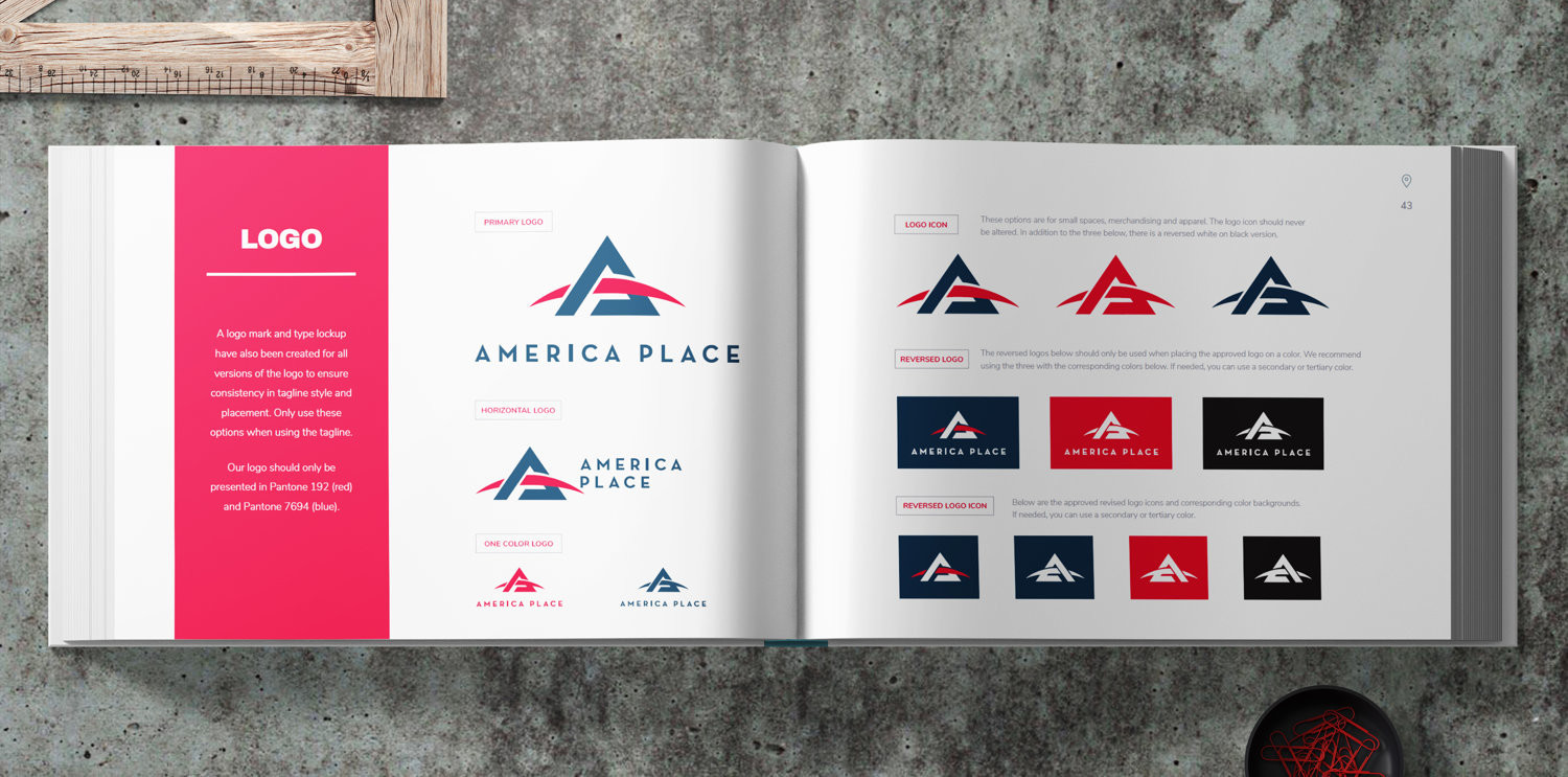
In developing a new face for America Place, we drew inspiration from the big idea at the heart of the brand: opportunity. We refreshed the previous palette from standard red, white and blue to a proprietary color palette with dark, rich navy and bright, bold red in order to convey a sense of history and establishment along with exciting, forward-looking energy.
The logo was a significant departure from the original. The A-frame at once invokes movement and solidity, while the curve in the logo calls to the horizon and all of the opportunities waiting just beyond it. The curve also nods to the curvature of earth, as the company looks to attract more clients from across the globe.
RESULT
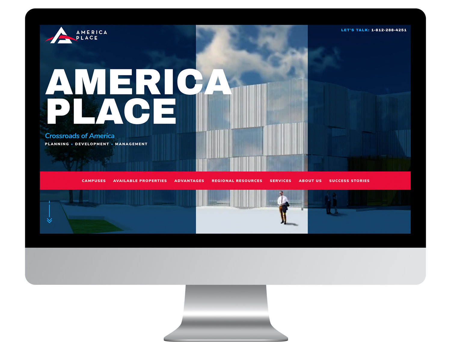
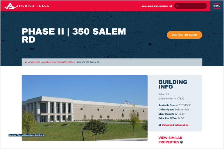
The new America Place brand is now fully implemented across the company’s sales and communications collateral and signage. It is also incorporated into its new website, which we built once the branding process was complete.
The old America Place website was heavy on information but light on inspiration. With “opportunity” as our theme, our goal was to retain the informative aspects of the B2B site while adding color and spirit to convey the excitement and new possibilities.
We added heart to the website using an ambient video on the home page and aspirational headlines in bold typefaces—and we created a UX that is user-friendly and intuitive. The result is a website that looks and feels hopeful and optimistic. Just like its namesake land of opportunity.
‘Murica!


