Problem Solving for Problem Solvers
The Problem
Challenges Ahead
Hafer’s story was a powerful one. The tale of a protagonist who set out on his own, and built a powerhouse of a team. But unlike a good book, people judge brands by their covers. Sometimes a brand is a company’s first — and only — impression. Hafer recognized their antiquated look was holding them back. It didn’t feel creative, which is really problematic when you’re selling your team’s ability to creatively solve problems. Their story was also lacking when it came to their process, which focuses on how their designs impact people's lives. That human element was missing.
They came to OOHology for help crafting the company’s story, creating a new website to tell that story, and rolling it all out with a marketing plan.


The Solution
Branding Solution
In order to really understand the state of affairs, we dug deep. We interviewed their architects, engineers, marketing specialists, partners, and even clients. We consistently heard an unwritten mantra: “This place is about creatively solving problems.” But even with that storyline, the brand felt stale. After a competitive analysis, it was clear Hafer’s work was among the best, but you would never know it from the outside looking in.
We introduced a new brand concept, complete with a mission to “collaborate with clients to create environments that inspire today, tomorrow and for years to come.” We brought their passion to life, and showcased their ability to be creative in finding solutions.
The company name had been “Hafer Associates” for years, and under our recommendation, they made the shift to just be “Hafer.” It was more renowned, and didn’t sound like a law firm.
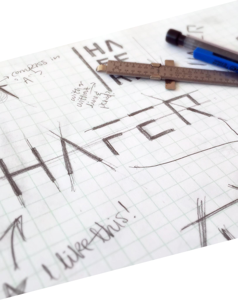
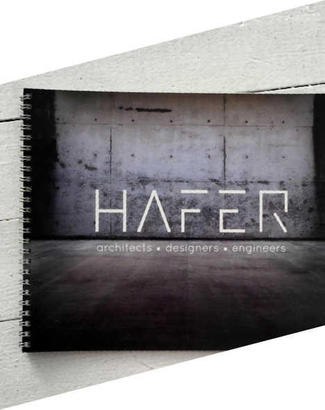
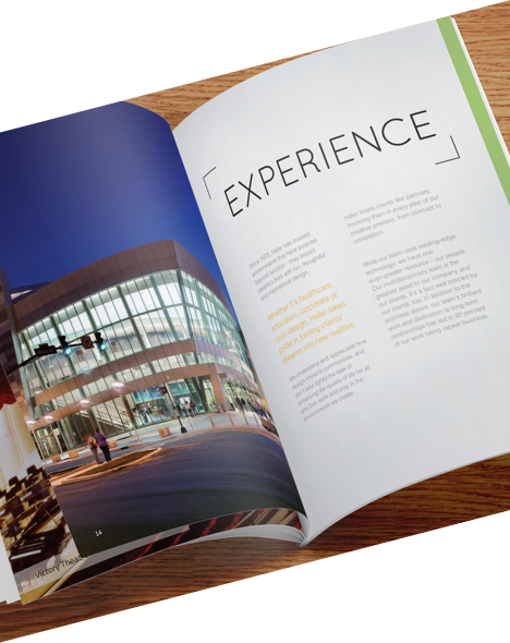
The concept of the brand came to life in a complete overhaul of the visual aesthetic. We’re talking a wildly different color palette, and a very minimal look and feel. This was applied to all of the company’s collateral, sales presentations, and a new website (which was the biggest overhaul for the brand).
Hafer's rebrand in action, seen here playing out in their new proposal document.
Web Design and Development
In our discussions with the partners with the firm, it was clear they wanted something that was different, right down to the architecture of the site. We flipped the user experience on its head, and assumed nothing. The right-side navigation menu is unexpected, yet incredibly easy to use. It keeps the company’s visuals front and center, including a video of the Hafer team in action on the homepage. This atypical structure allows Hafer’s work to do the talking, while never being encroached by drop-down menus or layers of sub navigation.
A big part of Hafer’s brand is collaborating and listening to what their clients are looking for, so we built a site that does the same. As a user navigates through the site, the content management system pays attention to what kind of content they’re interested in. If the site realizes this person is looking at architecture content, it showcases links to architectural content in the sidebar (case studies or service pages). If they’re into interior design, it showcases those pages. Likewise, if a user is interested in a specific vertical, such as healthcare, we showcase healthcare-related content.
Putting it into the Wild
Marketing the New Brand
When you pour your heart, soul and resources into a rebrand of this size, you want people to notice. Especially when you’re conquering misperceptions about the brand. So we helped Hafer plan a big rollout on a small budget. And man did we bring a big bang.
The “Dreams to Life” campaign focused on Hafer’s passion, people, and constant pursuit of perfection. We designed a custom landing page to showcase this story, and unveil the new brand in the process.
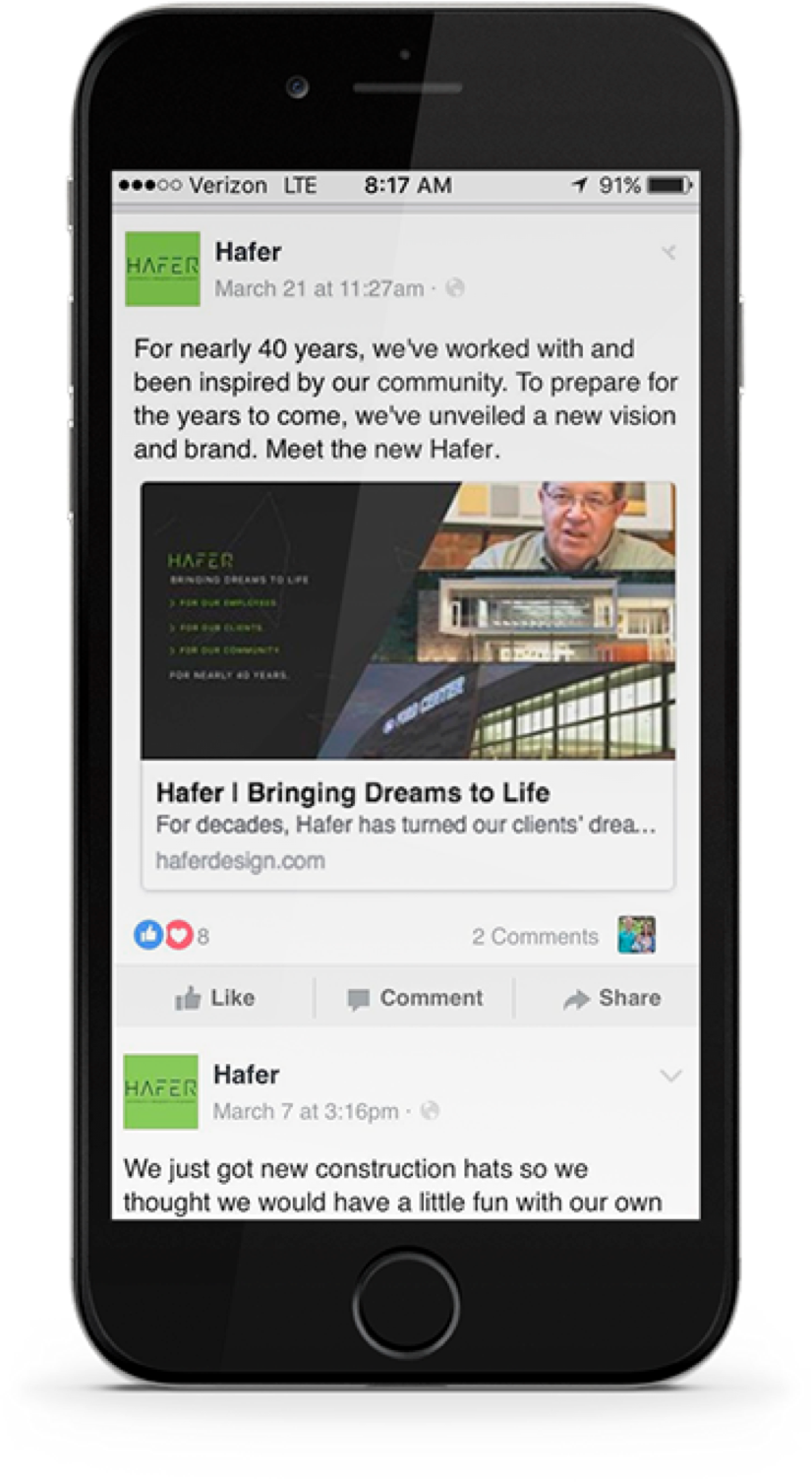
Before the rollout of the new website, we tracked users who were visiting the old site. Once the brand launched, we retargeted users with rich media display ads, letting them know something new was happening at Hafer. We ran a tightly targeted social media campaign, focusing on potential clients in the Midwest. And finally, we sent an email to Hafer’s email list. All of these marketing efforts pushed people to the landing page to experience the story.

The Outcome
The Campaign was Wildly Successful
The social campaign had 15,000 impressions, and display had over 60,000 impressions. Our click-through rate for the display campaign was well above industry average. We expected the email to do well, given these were people familiar with the brand. However, we couldn’t have predicted these results. Even we were surprised when the open rate hit 45 percent, and the click-through rate was 15 times industry average. The new brand launch was such a hit, Hafer has seen an incredible 1,200% increase in career applications.
While the numbers were great, the best part of this campaign was the feedback the client received. The company was flooded with praise for the new brand. At one point, we received a five page PDF with praise from our clients’ clients. Don’t take our word for it, though. Here’s a sampling:
“WOW. What a transformation! Seriously, I have looked through quite a bit of the site and it’s really impressive. What I like most about it is that it’s really daring, really different. I would not have expected this at all. Would be interested to hear how you came to this new look and the thought behind it. Very nice job! Good luck with the roll out!”
We were so glad to see all of the notes of praise, but the best one came from our client:
“The rebrand positioned Hafer as a creative, professional design firm. The website is innovative, yet user friendly, and I think it's great how it showcases our people. I also loved the website’s copy. It’s clear, clever and sophisticated, just as we designated in our brand’s voice and tone. Having those guidelines for the brand has made it incredibly easy to scale our brand to new materials, all in a consistent manner. Looking back on this process, the reason we chose OOHology was the exact thing that made all of this so successful. The OOH team is responsive and personable, and it’s so obvious that they really care about every aspect of their work. That dedication to excellence really aligned with who we are, and what we wanted to capture.”
The Numbers
Not too shabby, eh?
-
2
-
1200%
-
15x